
The CoCA Logo: An Historical Perspective
Ray C. Freeman III, CoCA Executive Director
Originally written April 23, 2015
Updated April 25, 2021
Updated April 15, 2023
Updated April 30, 2023
Updated August 12, 2025
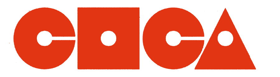
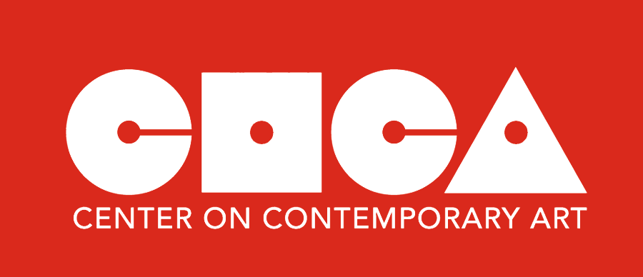
Since some time in 2009, I have considered myself to be the de-facto curator of the CoCA logo. No one appointed me. It's just something that matters to me, I and realize that no one else was doing it. On the one hand, one might wonder, what's to do? The CoCA logo is the CoCA logo. Everyone knows what it looks like. On the other hand, I guess that's why no one else took it on. I didn't originally know who designed the logo, but I recognized that it was done with great skill, as you will see. I have recently learned that it was my old friends Warren Wilkins and Tommer Peterson. I should have known. The text "CENTER ON CONTEMPORARY ART" that appears below the logo on Warren's own website appears to have been added much later, and I don't believe that the text was an integral part of the original design. More on that later. The following is the very first implementation of the CoCA logo that I can find in the wild, and I have only recently come across it. I have a feeling that it must have been used previously, but I have yet to uncover any solid evidence of that. Warren says it might predate his presence on the CoCA Board in late 1981, so there's a good chance it was with us from the beginning. It appears on a flyer and poster for an event called "PUBLIC COMMENTS" that took place at 2216 Western Avenue, 2 blocks North of the Public Market, according to the flyer, from December 3, 1983 through January 28, 1984. In order for this flyer to have been produced in advance of the event, this means that the logo was created before December, 1983. The way that it is used makes it appear as though the designer expects the viewer to recognize it.
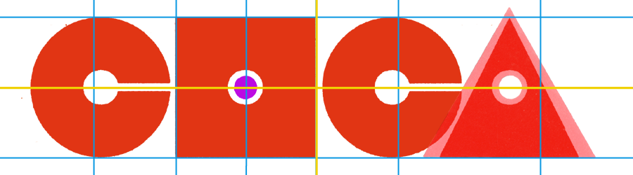
This logo probably looks pretty familiar to you, as it resembles in most respects the current CoCA logo. But it hasn't always been that way, as we shall see. For comparison sake, let's take a look at some of the finer details of this original logo. Here is a diagram that I will use for reference when looking at other implementations of the logo:
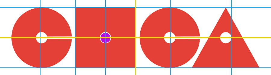
Here, I have drawn a yellow line through the center line of the circular "C"s and the right edge of the square "O". In addition, I have drawn a blue line through the top and bottom of the square "O", the left side of that same letter, and the center lines of each small circle in the interior of the letter forms. The purple circle at the center of the "O" will be used for comparison with later logos. There are a number of interesting characteristics that stand out in this original design: First, the "O" itself is indeed a square. This is of sufficiently significance that I will used the height of the square "O" as a reference in the upcoming diagrams. Overall, this is a very geometric design. The "C" s are perfect circles, and the "A" is an equilateral triangle. The baselines of the "O" and the "A" align, but the "C"s are somewhat larger - a pretty standard typographic convention. The rounded letterforms in any given font usually extend slightly above and below the baseline established by the more rectangular characters, otherwise they appear smaller to the eye. Further, the smaller circles are exactly in the center of the larger circles and square. All four small circles are perfectly aligned, and the horizontal slots in the two "C"s are centered on the same center line. The triangular "A" presents a geometric challenge, as putting the small circle at it's geometric center would make it lower than the other three. Instead, the triangle is a little taller than the rest of the letters, putting a little more "meat" around that central circle, simultaneously keeping the letter "upright". The result is a very satisfying compromise which, although geometrically insprired, makes accomodations to the individual letter forms in order to keep the overall composition pleasing, as well as the relationships of the letters one to the next. This basic design remained intact with the publication of the "COCAZINE" in 1986. Here is the logo (with regulating lines) from that magazine:

So, for at least four or five years, there was no significant change in the logo design. The first major change that I have noted took place in 1999, with the printing of a newsprint publication called the "CoCA News":

At first glance, there isn't too much difference, but upon further analysis we see that several changes have taken place over the intervening 13 years:

The square "O" remains the anchor of the design. However, the two "C"s and the "A" have shrunk to slighly less than the height of the "O" itself. This has caused the letters to pull together, resulting in a narrower overall width. Note the change in centers (new centers marked by the green lines) of the "C"s as they move toward the square to compensate for their smaller diameter. As the "A" has shrunk as well, it too has moved toward the center. This has caused the "O" to take on a more prominant role in the overall composition, whereas the letters had previously been finessed to have more or less equal weight.
By 2004, more changes had taken place:

Again, the changes are subtle, so throwing some analytical lines over this helps to see what's going on:

The most obvious change is that the small circles in the middle of the letters have gotten larger. The red dot represents the original size of the circle, scaled to the height of the "O". But there are other changes as well. The "O" itself is no longer a square. One might be tempted to think that it has narrowed. The yellow line still marks the right edge, and the purple line on the left shows how much narrower it is than the original, as marked by the blue line. But on the other hand, I would argue that it has actually gotten taller. Note the displacement of baselines between the "O" and the "A" (purple line at base). The two "C"s share the baseline with the "A", and only the "O" descends below. Further, the center line of the circles inside the "C"s has also shifted upwards (purple line at center), while the center of the circle in the "A" remains in line with the one in the square "O". And although it has grown slightly larger than the other holes for some unknown reason, the lower circle in the "A" helps to keep it from getting too close to the edges of the triangle, a fate that future versions will unfortunately not manage to avoid. An even more subtle adjustment is that the "slots" in the "C"s are no longer aligned with the center of the circles, but moved upwards slightly. In fact, the lower edge of the slot is now in line with the center of the "O".
Once it had started to change, all Hell broke loose. Only a year later, in 2005, the following logo appeared on the CoCA website, and was still in place on some official documents when I got involved in 2007:

What can I say? The technical term for this is "bastardization". Tommer Peterson speculates that some of the variations might have occurred over the years as digital applications became more common (it was called "desktop publishing" at the time) and if original copies (called "stats" or "photostats") were not readily available, it was fairly easy to simply attempt to recreate the geometric logo with varying degrees of success. I would only add there were varying levels of failure, as well. Some more spectacular than others. Although it probably isn't necessary, let's look at another diagram:

So, the "holes" in the letters have more than doubled in size, the "slot" is enormous, and the equilateral triangle has morphed into something entirely different (as compared to the original shown behind it), but at least the square is square again, and the "C"s have returned to more or less their original positions by increasing the spacing between the letters. The change in the triangle appears to be a foolhardy attempt to make all the letters the same height and width. The base of the triangle is the same as a side of the square, and the height remains the height of the square. Mathematically reasonable, but visually awkward.
Fortunatly though, by 2007, the pendulum had started to swing back. This was the logo on most on CoCA cards, announcements, posters, etc., when I came on board as Curator of the Belltown Gallery that year:
Again, overlaying the original grid is useful:
On first blush, this has a lot in common with the 2004 logo, but the square has remained square, and the holes have re-aligned themselves, but the triangle is still problematic. It's still not equilateral, it's too close to the "C", and it's not an optical illusion, the hole remains larger than the holes in the other letters. Go figure. I would have gone the other way to avoid the swiss cheese effect.
This is the logo that I was given to use at the Belltown Gallery, but I just couldn't do it. As a long time fan, I was familiar with the CoCA logo, and it just didn't look right to me. After a few months, I executed the following:

Looking back, this was a somewhat timid attempt, as I just made the "A" back into an equilateral triangle and pushed it away from the "C" a bit, but otherwise it was the same. However, I still wasn't comfortable. Those holes were just too big. It didn't take long before this gave way to:

In case it's not obvious, I tightened up the holes and the slots and adjusted the spacing between the letters slightly. Here's the original grid overlaid over this logo, which remains in use today:
This logo was based on what I had to work with at the time, and it has several attributes to recommend it. The vertical yellow line at the right edge of the square is the EXACT center of this version. That tends to come in handy when laying it out on a page, and in combination with other graphic elements. Everything is a "pure" geometric shape. The circles are at the centers, as ar the "slots". Nevertheless, you can see that it still falls short of the original "Gold Standard" in several respects. Even though I made the holes and slots smaller, I didn't go far enough. There is still a little daylight between the original (purple) hole and the new ones. Also, because every version that I had seen had matching heights for all the letters, I implemented it in that fashion. The original was less pedantic but more visually pleasing, with it's oversized "C"s and tall "A". I would very much be in favor of a return to this original design in the future, and I plan to execute a new digital version ASAP. Here's a reminder of the original:
Update (2021)
I have recently returned to the drawing board to attempt to create a more "perfect" version of the CoCA logo, and have come up with this:
This new proposed iteration is based on several different inputs and factors. Largely, I hoped to re-instate the visual subtleties that were a part of the original design. These include the slighly larger "C" forms, and the slightly taller "A". These are also in keeping with an execution of the logo proposed in 2020 by Ishi Malik and Soon Choi. Second, I still thought that the circles (holes) and slots in the letters were a tad too large. I squeezed them down to 90% of the current version, which brings them almost to the size of the original. I didn't go further, because I have noted that any smaller than this, and they tend to clog up with anti-aliasing on computer monitors when the logo is very small. I also tightend up the spacing between the letterforms a bit to bring them closer to the original, but for the same reason, not too much. It made me feel a little better that Warren Wilkins seems to have opened them up a bit on his presentation of the logo on his own website.
That Darned Text
The earliest iterations of the logo that I have been able to find (including the first) have no text below the logo at all. The logo was expected to stand on its own, and the name "Center on Contemporary Art" was somewhere else on the page. From time to time, text appeared under the logo, but not in the form we know it today. Often it was a date, or the name of an event, venue, or address. Occasionally, it was all of the above, in a block.
It wasn't until around 1990, on a poster for Warner Blake's "Voice of the Machine", presented in collaboration with On The Boards, that the words "CENTER ON CONTEMPORARY ART" appear directly below the logo, stretched out to the the length of the logo, and presented as a unit together with the logo. The font used has a lot in common with Century Gothic Bold and Futura Heavy, but reminds me most of all of the font favored by Salesforce, the CRM software giant, called Salesforce Sans Bold. It isn't any of these, but you get the idea. Around the same time, the same thing happened to the MOCA logo. The words "THE MUSEUM OF CONTEMPORARY ART" started appearing, occasionally, below their logo, in Standard Medium, the same font used by Vignelli and others in New York Subway signage applications. Eventually, both the New York Subway and CoCA converted to Helvetica, and later to Arial, once that became the popular sans-serif typeface of the day.
All this is to say that it's kind of irrelevant, in my view. Various designers have used whatever simple sans-serif (contemporary, of course) typeface was readily available and popular. The only thing that's really interesting about it is the visual problem associated with attaching text under the logo. I will use my latest implementation of the logo to demonstrate the issue. I will use Century Gothic Bold for the examples so I don't have to pay a royalty to Saleforce.

Do you see what's going on here? One immediately notices that although the CoCA logo starts with the roundest of letterforms, it ends with the pointiest. How do you "align" text under that? The earliest uses absolutely aligned the end of the text under the end of the "A", but held the beginning of the text some arbitrary amount inward from the left side of the "C". Probably a smart move, but the text does look a little like it has slid to the right. On the other hand, most of the time, I have done it like this:

Sure, that's aligned, but it doesn't look like it. It looks like the words are sticking out to the left. So it seems like you're damned if you do, damned if you don't. Malik and Choi returned to the original, with a slight indent on the left, but I have another idea. Why not split the difference? One might argue that by pulling the text in from the right side, we can mirror the angle of the "A" to some extent, in the same way that we are respecting the curve of the "C".
Meh, it was just a thought.
Since I don't consider it to be an integral part of the logo, I won't waste any more space on it here. It's recently been proposed that we use a "custom version of Avenir" for the font. Whatever. As long as it's sans-serif, contemporary, and of course, popular. It would seem that Mr. Wilkins agrees, on all counts:

Let's throw some lines on there and see what we can learn from most recent execution by the original author:

O.K. Warren, I see what you did there.
Update (2023)
A new variation popped up on the CoCA website recently. Let's have a look:

I put a couple of center lines on there for reference, related to the main four letters of the logo. My first impression of this logo are pretty good. The square is a square, the circles are round, and the triangle is equalateral. Check. The circles are somewhat larger than the square, which visually and historically appropriate. Check. The size of the holes is pleasing. I am not a big fan of putting the logo inside a box, but if you're gonna do it, like for a bumper sticker or something, make it a big box (in proportion to the logo) - give it some breathing room - and they did. Check. Personally, if I was going to do it, I would have put the main logo in the center. OK. A couple of miscues, if you ask me. The circle in the 'O' is somewhat smaller than the others, and the one in the triangle is somewhat larger. Huh? Also, the circle in the triangle is higher than the others. If it's going to be off-center at all, it should move down, to downplay the proximity to the edges, but I wouldn't even do that. Bring it back in line. Finally, the right edge of the square 'O' is not at the center of the logo, but that's a nit. I have my reasons for wanting it there.
Here's my shot at it, with the above in mind:
Update (2025)
The 2023 reverse logo with red rectangle has been retired from the website and replaced with this positive version:

Color
Don't. Get. Me. Started. Orange is the new red, I guess.
Logo Variations
Aside from color (all of the example shown so far have been either red or black, and the red has varied somewhat), a number of other variations have sprung up over the years, each of which presents interesting challenges.
Outlining:

This example from 1999 is probably the most successful way to do outlining. The trick is that the center line of the outlining line follows the shape of the letter. Putting the outline to the inside OR the outside generally produces less desirable results, i.e, this example from 2004:

Even though this is based on a pretty standard logo, the outline producing something way to similar to the 2005 "big hole" version. In fact, it might just be the source for that. Just imagine taking away the outline....
Special Characters:
Most of the variations that pick out one letter as special concentrate on the "O". A common way of highlighting it is with color, like this version from Holiday 2000:

Combining outlining with special color, we get this version from a postcard in 2004:
Finally, I have recently created this digitally-compatible version for certain special uses, based on the same idea, but using a QR code that points to the CoCA website:

Other Variations:
Over the years, various temporary logo "treatments" have been executed for special occasions or uses. Here are a couple of examples:

Precedents, Inspirations, Derivatives
The MOCA logo was apparently created the same year as the CoCA logo by Ivan Chermayeff and Tom Geismar, and has recently been revived by MOCA:

A more recent example is the Center for Contemporary Art, who debuted their logo in 2010:

Even more recently, Coolkidz, a group of artists in Iran, combined it with a version of Baby Teeth:

Outside the art world, numerous other similarities to the form, especially the "C" exist:

State Bank of India, Columbia Records, Pokemon Go, Celltech, DJ City.
Finally, AOGO Singapore Kiosk Technologies might have visited the CoCA website:

More to Come...
Technical details, usage guidelines, tips an tricks, DOs and DON'Ts, more examples and downloads.